Stackhomes is developing a new approach to residential construction, based on the prefabrication of cross-laminated timber (CLT) modules. To support the launch of the company, PicSel developed a graphic identity and a website capable of reflecting this constructive, architectural and pragmatic approach.
The challenge was to give a young brand a sufficiently strong and structured presence to exist in a very competitive sector, while highlighting what makes it unique: a construction system designed to combine speed, precision, cost control and architectural freedom.
The client
Stackhomes is a construction company, based in Liège, Belgium, specializing in affordable and rapid CLT modular construction.
At the origin of the project, Gabriel Lakatos, son of an architect, has designed, built and developed real estate projects for more than three decades. Driven by the desire to evolve construction methods, Gabriel imagined a construction system based on a conviction: prefabrication can improve precision and speed of execution without limiting architectural design.
The context
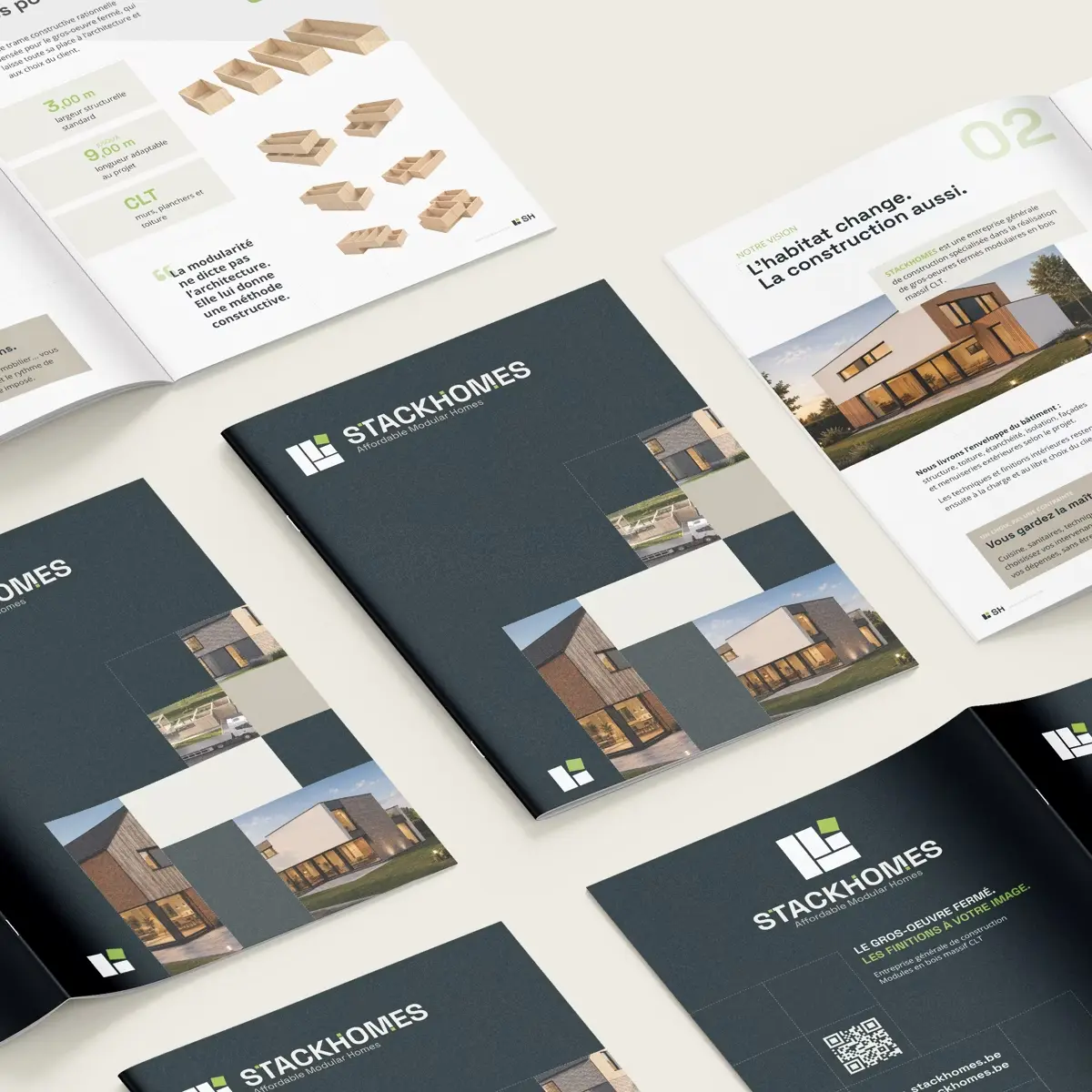
To launch his project, Gabriel needed a graphic identity, a website and some basic communication supports.
PicSel first developed the Stackhomes identity, before designing and developing the website on this basis, based on content provided by Gabriel and a copywriter.
The objective
For identity: differentiate the brand and give it its own and identifiable identity, while remaining within the codes of its field of activity.
For the site: it was a matter of clearly presenting the brand, its concept and its architectural and constructive choices, in a simple and accessible structure. The site also had to allow Stackhomes to appear credible and accomplished despite the lack of achievements specific to a company that had just launched.
The result
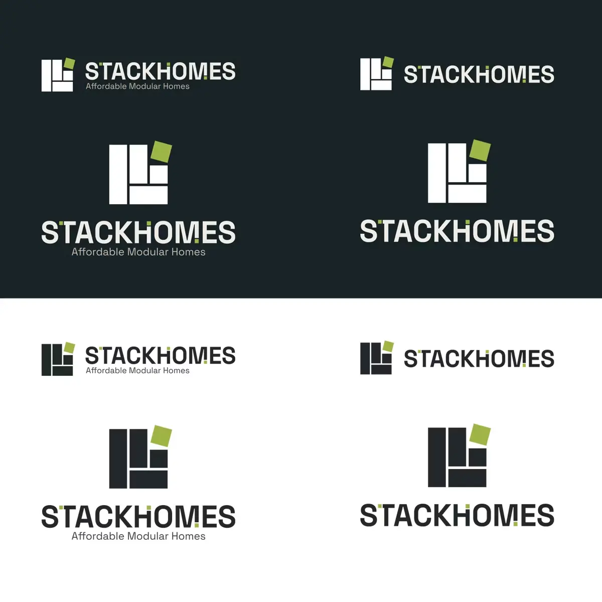
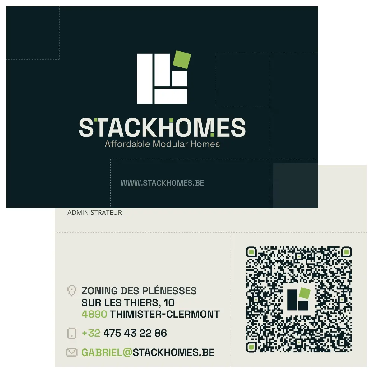
The identity developed for Stackhomes is based on a contemporary graphic universe, built around a visual language inspired by modularity and construction. The logo, typography, color palette and different graphic elements form a coherent system, both identifiable and flexible enough to support the brand’s different media.
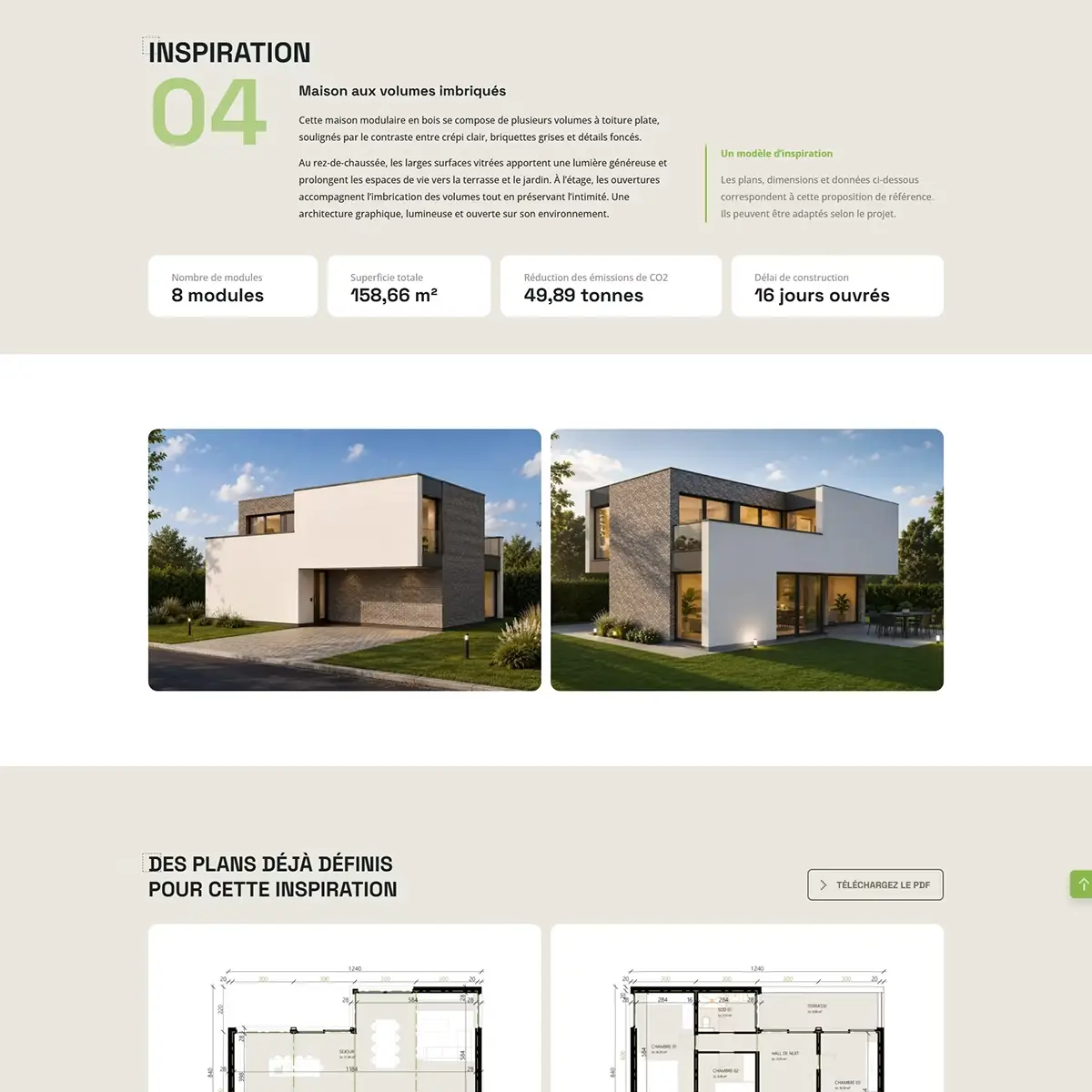
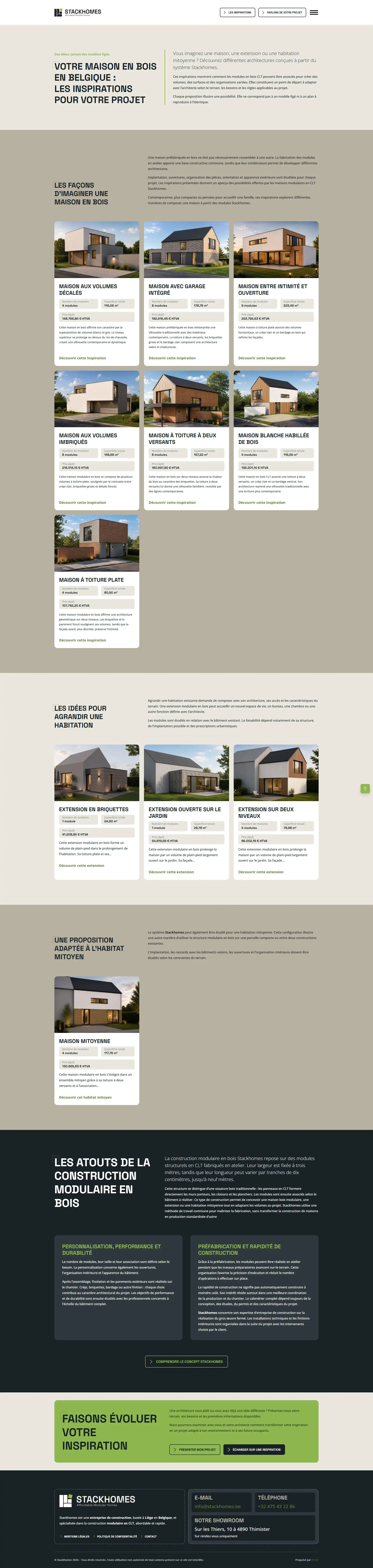
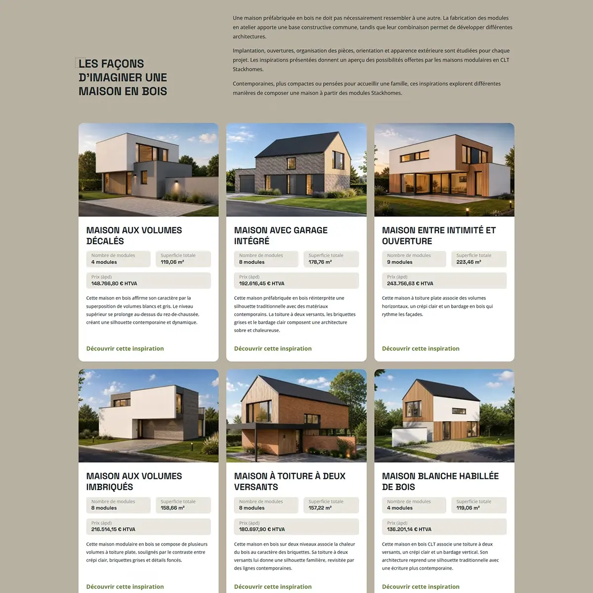
The site uses this logic by organizing the content as a set of modules that can be assembled and combined. The layout thus alternates editorial blocks, images, calls to action and thematic content to progressively present the concept, the architectural possibilities and the construction process.
This approach makes it possible to give personality to a brand that is still young while compensating for the absence of numerous achievements specific to Stackhomes: rather than seeking to mask this lack of references, the site highlights the construction system, its possibilities and the projects that it allows you to imagine.