The client
GPasta is a fast food concept built on a simple and appetising idea: fresh, generous and affordable pasta to go. A fully committed street food positioning, urban and accessible, targeting everyone from the student in a hurry to the worker on a lunch break.
The context
Launching a new brand in the food sector means starting at a disadvantage: everyone eats, everyone has an opinion, and the visual competition is fierce. A kebab shop, a sandwich bar, a burger chain — every food business is competing to catch the eye before catching the customer. In this context, a strong visual identity is not a luxury; it is a prerequisite.
The founder of GPasta had the product vision. What he needed was the brand vision.
The brief
Create a complete branding from scratch (logotype, brand system, brand guidelines, print and digital adaptations) for a concept that did not yet exist. The brand had to simultaneously embody Italian authenticity and street food modernity, be instantly recognisable, and work just as well on a cardboard cup as on a 2m² billboard.
Values to convey: freshness, generosity, speed, urbanity, accessibility.
The approach
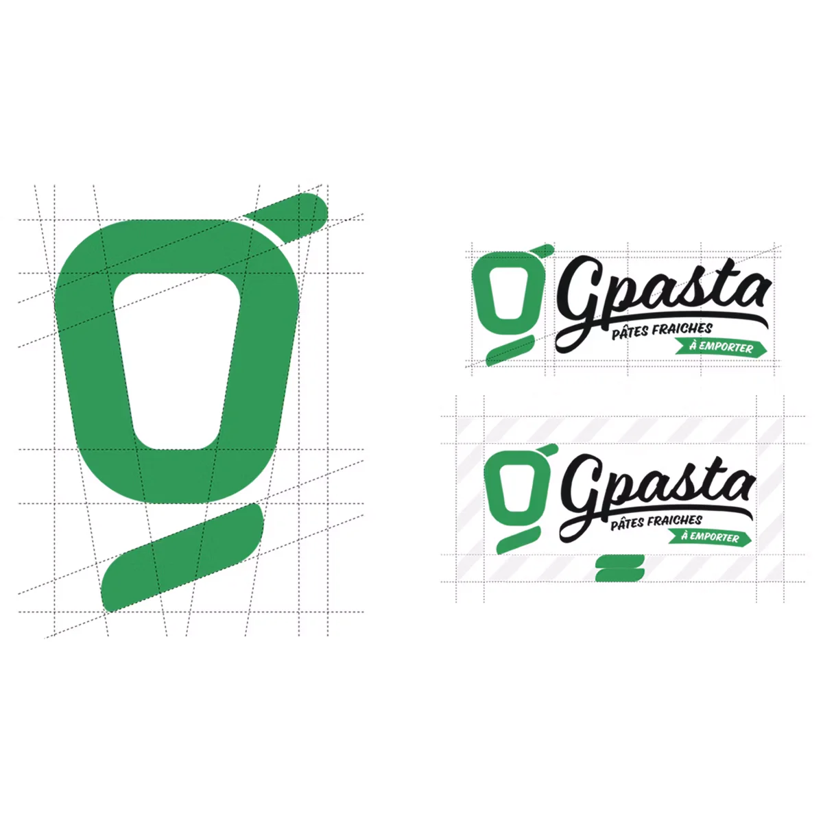
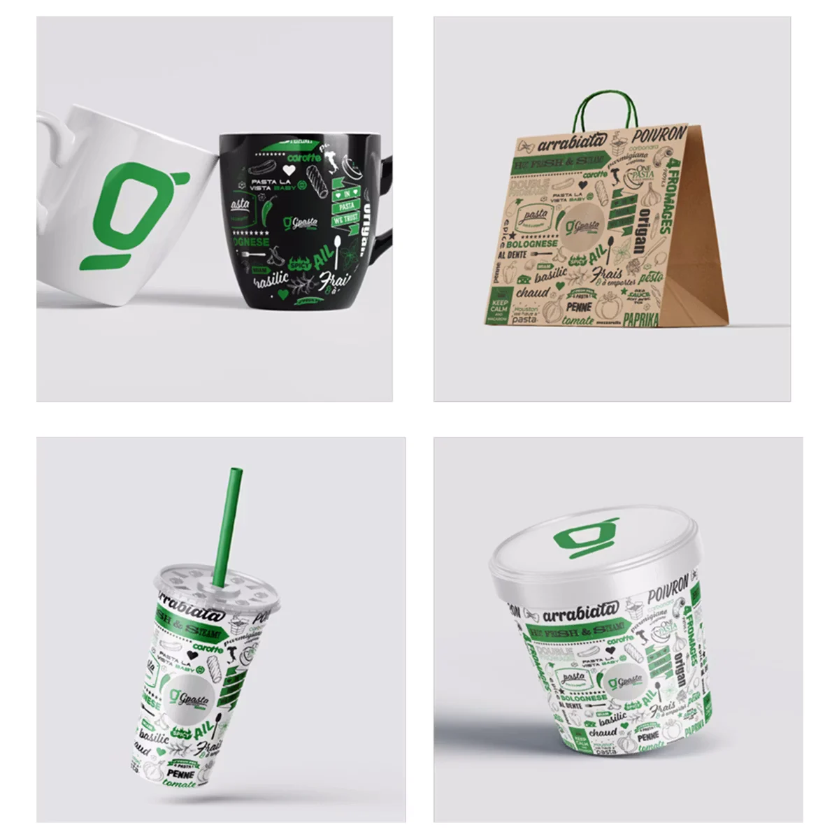
The starting point was the name itself: GPasta. A personal identity, almost a signature. The logotype had to carry that idea: something human and expressive, not a corporate brand.
The choice fell on a script typeface for the word “Gpasta”, a calligraphic font with character and energy, paired with a pictogram built around a stylised letter G evoking both a bowl and a spoon. Simple, legible, memorable.
The two-tone green and black palette was chosen for its readability and immediate visual impact. The vibrant, fresh, plant-based green anchors the brand in the world of food quality. The black asserts the urban, contemporary side.
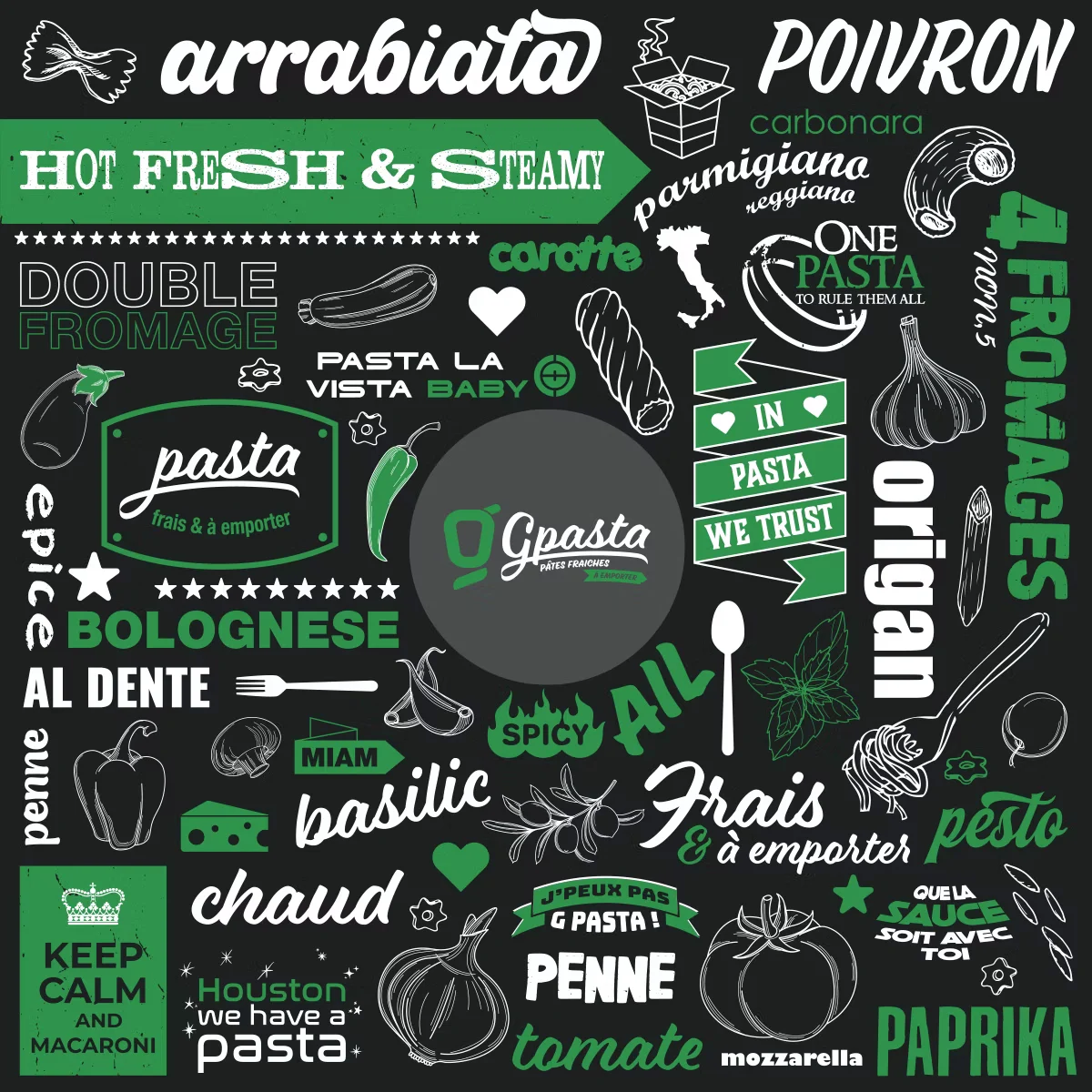
To enrich the branding beyond the logo, two patterns were developed: a subtle motif based on the pictogram for B2B materials, and an illustrative “Wall” teeming with culinary references, offbeat slogans and nods to pasta and pop culture for B2C materials such as cups, bags and packaging.
The deliverables
The branding was rolled out across all the graphic materials needed for the launch:
- Primary logotype and all its variants: light background, dark background, compact version, standalone icon, digital formats.
- Complete brand guidelines documenting usage rules, colours in all formats (RGB, CMYK, HEX, Pantone, RAL), typefaces and exclusion zones.
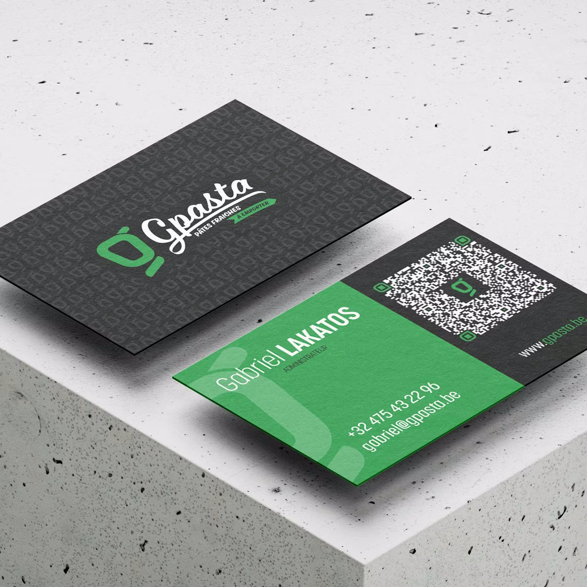
- Print materials: double-sided business cards, menu, promotional flyers.
- Packaging: cups, kraft bags.
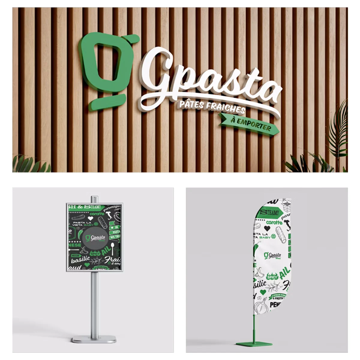
- Signage: illuminated sign, window decals, LCD display menu.
- Digital materials: social media templates, display banners, app icon.
- Apparel: polo shirt and cap for the team.
What this project demonstrates
Building a brand from scratch means making decisions at every step: the name, the shape, the colour, the tone, the adaptations, with no safety net and no existing reference. It also means anticipating every future use: an identity designed solely for digital falls apart when faced with signage or packaging. GPasta is an example of what branding and a complete brand system should be: consistent, adaptable, and solid enough to dress an entire brand from day one.